-
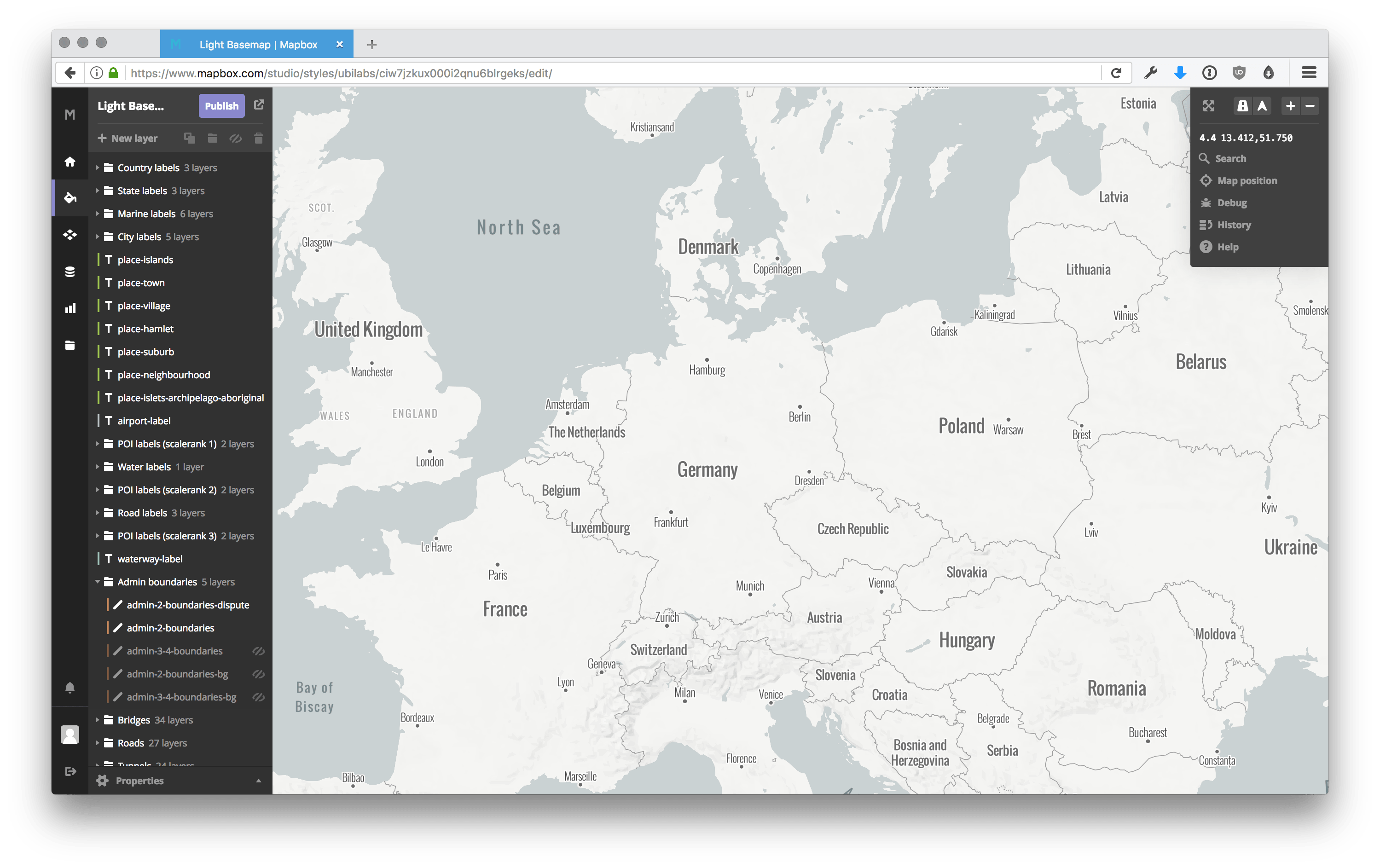

A light base map style in the Mapbox Studio Styles editor -
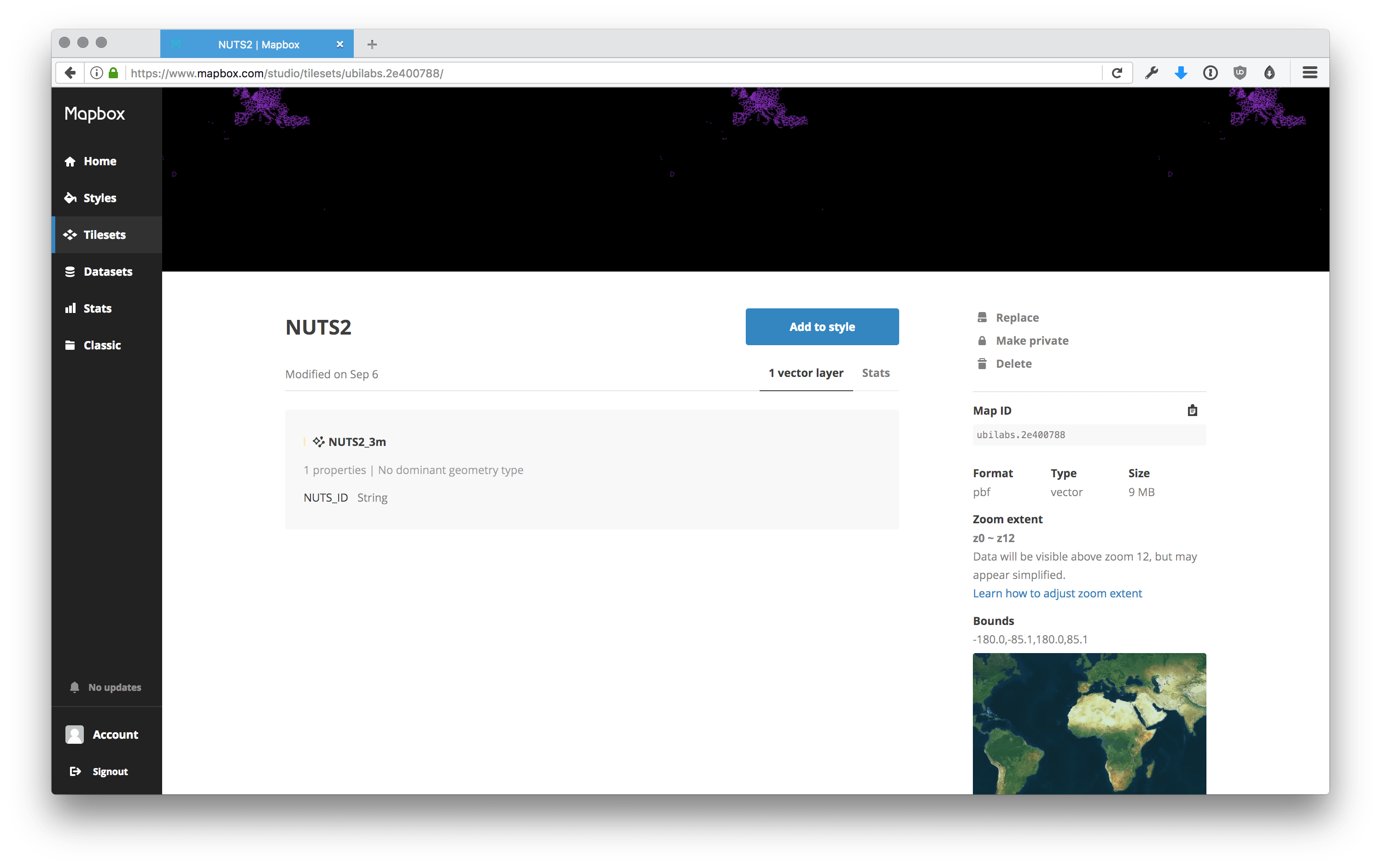
NUTS 2 area shapes in the Mapbox Studio Tileset editor -
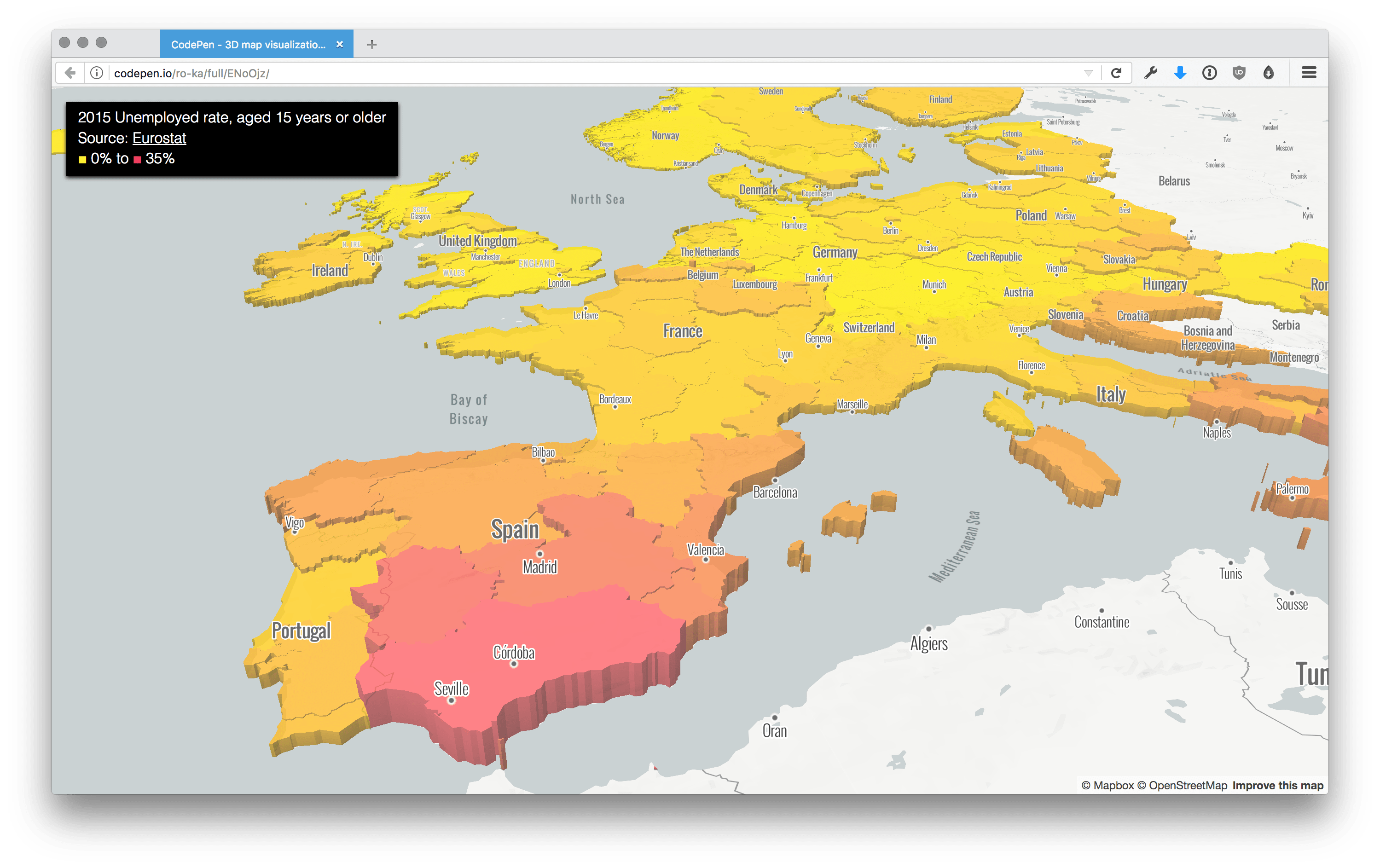
The result: a 3D map, created with Mapbox


3D Map Visualizations with Mapbox GL JS
Mapbox GL JS is a JavaScript library that uses WebGL to render interactive maps from vector tiles and Mapbox styles. Our front-end developer Robert Katzki will show you how you create a map with 3D functionality and add 3D data visualization to it.
In a recent update, Mapbox added extended functionality to create 3D data visualizations on a map. Besides the classic fill, line and so on data layers, there is now a new option: a fill-extrusion layer. I’m going to explain how to create a map with 3D functionality and to add 3D data visualization to it. We’re going to visualize the unemployment in Europe for people aged 15 years or older on a NUTS 2 level. The result will like the image above.
First, you need a basic map
For showing off our data, we’ll need a base map to render this data on. Create a new simple style in Mapbox Studio. There are already some dark and light presets (see screenshot above). Choose whichever you prefer and if you like, modify the base map to your likes. Note down the ID Mapbox assigns to this map style.
Area shapes on the map
To make a data visualization we’re going to need some area shapes to render and assign the data to. Some free data and area shapes can be found at Eurostat. Download the NUTS area shapes in your desired resolution. I’ve chosen the Shapefile on a 1:3 Million scale (see screenshot above). Upload the zipped Shapefile to the Mapbox Studio Tileset editor and again note the ID Mapbox assigns to the new data tile set.
Add data to the mix
For a nice visualization, we need some data. Get the unemployment data and filter as you like. With this data, we now have a dataset to make calculations with. I’d like a different color for each of the areas depending on the unemployment rate. Based on a color gradient, the higher the unemployment the darker red the area should be colored with. To not just show it via colors though, we will elevate the area shapes depending on the unemployment rate. The higher an area is elevated, the higher the unemployment rate is in that area.
To create a map with the NUTS areas as a layer combined with the unemployment rate data, we do the following:
// Create the mapbox map
const map = new mapboxgl.Map({
  container: 'map',
  style: 'mapbox://styles/ubilabs/ciw7jzkux000i2qnu6blrgeks',
  center: [1.230, 55.204],
  zoom: 3
});
map.on('load', () => {

// Add the NUTS data as a source to use

map.addSource('NUTS2', {

type: 'vector',

url: 'mapbox://ubilabs.2e400788'

});
// Create a layer from the NUTS data

map.addLayer(

{

source: 'NUTS2',

'source-layer': 'NUTS2_3m',

id: 'NUTS2-layer',

type: 'fill-extrusion',

paint: {

'fill-extrusion-opacity': 0.75,

'fill-extrusion-color': {

property: 'NUTS_ID',

type: 'categorical',

// Get the colors depending on their value

stops: getColorStops()

},

'fill-extrusion-height': {

property: 'NUTS_ID',

type: 'categorical',

// Get the height depending on their value

stops: getHeightStops()

}

}

},

'waterway-label'

);

});
The functions getColorStops() and getHeightStops() return an array each which assigns an area ID from the NUTS shapes to a calculated value based on the unemployment rate in that area.
The Result
With just a bit of code we get a great looking 3D map you can touch (right click + move to change viewpoint):
See the Pen 3D map visualizations with Mapbox GL JS by Robert Katzki (@ro-ka) on CodePen.
This article is also available here: https://robert.katzki.de/posts/3d-map-visualizations-with-mapbox-gl-js